Loading...

Smart Tools deep dive · 17 min read
How to Use My Portfolio
A complete walkthrough of the Portfolio tab in your Trade Journal. Every card, chart control, risk metric, and table column explained, with real workflows for a morning book check, reading allocation concentration, and running a scenario what-if.
Open the tool →Hey guys, Art from TraderMatrix here. The page I want to walk through today is My Portfolio, which lives at /journal/positions under the Portfolio tab in your Trade Journal. It's the page I open first thing in the morning before I look at anything else on the platform. Not because it has live market data, but because it tells me what I'm actually holding and what my real risk looks like across the whole book. That's the context everything else runs through.
The short version:
- My Portfolio is a risk dashboard built from your journal entries, not a brokerage account view. It's only as accurate as your logging.
- The four KPI cards (Net market value, Today, Unrealized, Realized) are the first read. Net market value is a net-liq figure, so a book with written options can show a negative number without anything being wrong.
- The equity curve runs on daily snapshots of realized plus unrealized P&L. The allocation donut has four views: Ticker, Calls · Puts, DTE, Long · Short.
- The risk widget shows five book-level numbers: net delta, beta-weighted delta, theta per day, premium at risk, and top concentration. These aggregate across the whole book, not per-ticker.
- The scenario what-if runs entirely in the browser. Drag three sliders (SPY move, IV shift, time passage) and the page reprices every open position at once.
- An unlogged trade is invisible. Log at entry, every time.
What this page is and what it isn't
A lot of members open My Portfolio expecting something like their brokerage's account view. The two serve different purposes.
Your brokerage shows you buying power, margin, account balance, and positions pulled directly from their system. It knows exactly what you hold because it's the counterparty. My Portfolio knows only what you've told it: the trades you've logged in the Trade Journal. There's no direct brokerage connection unless you've added the ConnectTrade add-on, and even with that, the core portfolio page reads your journal entries first.
What My Portfolio does instead is aggregate those entries into a risk view. Where is your capital concentrated? What is your book's net delta? How much theta are you collecting or burning per day? If SPY moves down 3% tomorrow, what happens to your book? Those are the questions this page answers. A spreadsheet can do the same job in theory, but not with live marks, not with scenario repricing, and not while you're watching an intraday session.
The limitation that follows from this design is real: the portfolio view is only as accurate as your Journal. If you log a position three days after entry, the equity curve had no idea you were exposed during those three days. If you close a trade and never record the exit, the position sits open forever in the portfolio. This isn't a bug; it's the architecture. The journal is the source of truth.
Important: An unlogged trade is invisible. My Portfolio can't know about a position you haven't recorded. Log at entry, every time.
The page requires a Premium subscription. Free accounts see a tier gate with an upgrade link instead of the dashboard.
The screenshot
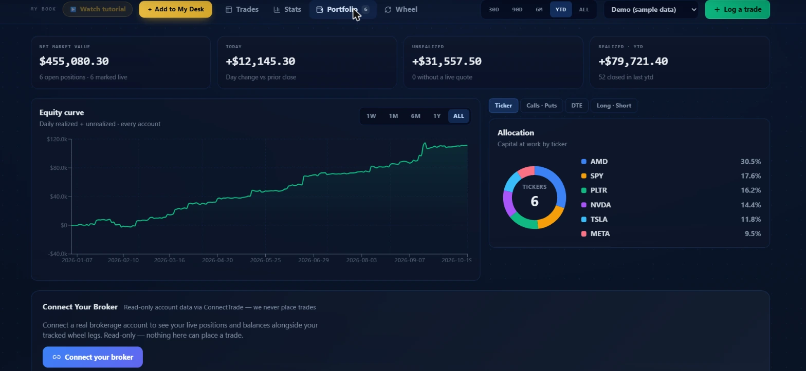 Demo account loaded with sample data. All numbers shown are illustrative and not anyone's actual results.
The screenshot shows everything above the fold on a wide desktop. Four KPI cards across the top. Below that, the equity curve on the left and the allocation donut on the right. Below those (not visible in the screenshot) is the ConnectTrade broker panel, then the book-risk section with the risk widget and the scenario what-if, and finally the holdings table with Open, Closed, and All tabs.
The four KPI cards
Net market value
The leftmost card. In the demo screenshot it shows $455,080.30 with "6 open positions · 6 marked live" underneath.
Net market value is a net-liq figure, not a sum of purchase prices. Longs count as holdings (positive). Shorts count as the debit you'd spend to close them (negative). That means a book where you've written more premium than you hold in long positions can genuinely net below zero, and that's correct, not a display error. On a long-only book the number is straightforward. On a book with sold options or covered calls, the two halves of the figure (long and short) show separately when the short side is contributing, so you can see what's doing what.
The "marked live" count tells you how many positions have a current market quote feeding into their unrealized P&L.
Today
Second card. In the demo it shows +$12,145.30 with "Day change vs prior close" underneath. When the market is in pre-market or after-hours, the label switches to "Incl. pre-market move" or "Incl. after-hours move" so you know whether extended-hours activity is folded in.
This is the aggregate day P&L across all open positions that have a live mark. Positions without a current quote don't contribute, so the Today card can understate the actual daily move on days when some positions haven't received a fresh mark yet.
Unrealized
Third card. In the demo it shows +$31,557.50 with "0 without a live quote" underneath. Total unrealized P&L on all open positions, aggregated. The subtitle tracks how many positions have a live mark and how many don't.
Realized · {range}
Fourth card. In the demo it shows +$79,721.40 with "52 closed in last ytd" underneath. The range label matches whatever time window you have selected in the workspace bar: 30D, 90D, 6M, 1Y, YTD, or ALL. This is the total P&L banked on closed trades within that window, pulled from a server-side summary that reads your full closed history, not just the newest rows in the table.
The range selector in the workspace bar slices the closed side of the book only. Open positions are open right now regardless of when you entered them, so the range filter doesn't hide open positions, only changes which closed trades count toward the Realized card and the closed table.
The equity curve
Below the KPI cards on the left side sits the equity curve. In the demo it shows a chart running from early January 2026 through mid-October 2026, with the y-axis going from around -$40k to a peak near $120k.
The subtitle reads "Daily realized + unrealized · every account." That's the snapshot-backed version: the system records a daily snapshot of cumulative realized P&L plus current unrealized, producing one point per trading day. The curve you're looking at is built from those daily snapshots rather than computed live from raw trade data each time the page loads.
There are five time range controls on the top right of the chart: 1W, 1M, 6M, 1Y, ALL. These zoom the x-axis on the existing series. The ALL tab shows the full history from your first logged trade.
The equity figure at any point is cumulative realized P&L from all closed trades up to that date, plus the unrealized P&L on whatever open positions exist at that snapshot. The tail of the curve, the most recent point, reflects your live open book. Every closed trade that exits at a profit lifts the curve; one that exits at a loss drops it. Open positions move the tail as marks change through the session.
One thing worth noting: the curve is journal-only for now. Open wheel legs tracked in the Wheel Tracker feed into the risk widget and the allocation donut as part of the unified book, but they aren't folded into the equity curve itself yet. That's a known design decision, not a gap.
Try this: Switch the range to ALL and look at the shape of the curve, not just the endpoint. A curve that stairstepped up with a few flat patches is a different execution picture than one that showed sharp drawdowns followed by recoveries. The shape tells you something the realized total number alone doesn't.
The allocation donut
On the right side of the chart row is the allocation donut. In the demo it shows six tickers: AMD at 30.5%, SPY at 17.6%, PLTR at 16.2%, NVDA at 14.4%, TSLA at 11.8%, META at 9.5%. The center reads "TICKERS 6."
There are four view tabs above the donut: Ticker, Calls · Puts, DTE, Long · Short. Each shows a different axis of concentration.
Ticker is the default. Where is your capital at work by name? Weighting here is by capital committed (cost basis), not by current market value, so a position you entered at a high basis shows its full original weight even if the market value has moved since.
Calls · Puts breaks out what fraction of your capital is in call positions versus put positions. Useful when you want to check whether your allocation is balanced between directions or skewed heavily one way.
DTE groups positions by time to expiry. The buckets show how much capital is in near-dated versus longer-dated positions. A book that's heavily weighted in 0 to 7 DTE is a materially different risk profile than one concentrated in 30 to 60 DTE.
Long · Short shows the split between long and short premium. If you're running a premium-selling strategy, this should show a heavy short side. If it reads mostly long, your theta will be negative.
The subtitle under the donut name explains what's excluded: uncovered short calls carry undefined risk (no capital ceiling to measure against) and unpriced spreads can't be sized without a mark on both legs. Both are excluded from the donut and named in the subtitle so a missing slice doesn't silently understate your exposure.
Try this: Switch to Ticker and look for any single name above 30%. Then switch to DTE and check whether the near-dated bucket is disproportionately large. Two reads, one minute.
Book risk: the risk widget
Below the equity curve and allocation, after the ConnectTrade panel, is the book risk section. It appears only when you have open positions.
The risk widget shows five aggregated numbers across your whole book:
Net delta (share-equivalent exposure). The sum of all position deltas expressed in share-equivalent terms. A net delta of +500 means your book behaves as if you were long 500 shares of a diversified equity book. Negative net delta means net short exposure. This is the number that shows your actual directional bet, not the sum of individual trades.
Beta-weighted delta (SPY-equivalent delta). Same concept, but each position's delta is first multiplied by that underlying's beta against SPY, then summed. If you're long a high-beta tech stock, its contribution to the book's SPY-equivalent exposure is amplified. This is the number to watch when you want to know how much you'd gain or lose if SPY moved one dollar.
Theta / day. The aggregate time decay across the whole book, in dollars per calendar day. Positive theta means you're collecting time premium (typically a premium-selling book). Negative theta means you're paying time decay every day (typically a buyer-heavy book). The subtitle says "Decay collected" or "Time decay bleed" depending on the sign, so you can see at a glance which regime you're in.
Premium at risk. The maximum dollar loss on all long options in the book. This is the sum of premiums paid for long options that could theoretically go to zero. It counts only long options, because short positions have already collected their premium and their maximum loss has a different character.
Top concentration. The highest-concentration single name as a percentage of gross exposure. If one position dominates the book, this flags it. The name appears in the subtitle below the percentage.
If you're running open wheel legs in the Wheel Tracker, a "Wheel included" toggle appears on the right side of the risk widget header. With the toggle on (the default), wheel legs fold into the same book-level greek read. With it off, you see only the journal positions. The toggle exists for cases where you want to isolate the journal view, but for most morning checks the unified read is more useful.
The scenario what-if
Next to the risk widget, in the same row, is the ScenarioPanel. This is where the book-level view earns its keep.
Three sliders:
SPY move % (range -10 to +10, step 0.5%). Simulates what happens to your book if SPY moves by this amount. Each position's underlying is moved by this percentage multiplied by that underlying's beta, so a high-beta name contributes more to the book-level impact than a low-beta one does.
IV shift (pp) (range -20 to +20, step 1 percentage point). Shifts implied volatility on every option by this many points. A +5 shift means IV rises 5 points across the board; a -10 shift means IV contracts 10 points. Options with higher vega move more per point of IV change.
+N days (range 0 to 30, step 1 day). Adds calendar days of time decay. Moving this slider forward is like asking what your book looks like if nothing else changes and you just wait N days. The theta on every position accumulates.
The panel shows the estimated book-level P&L change under those three combined inputs. It also tells you how many of your positions were included in the calculation; any position whose underlying doesn't have a current price available is excluded, and the count shows exactly which ones are missing. All the math runs in your browser from the greeks already loaded with your position marks.
The formula used for each options position is a second-order Taylor expansion: delta times dS, plus half times gamma times dS squared, plus vega times the IV shift, plus theta times the number of days. The underlying move dS is the spot price multiplied by the SPY percentage, then beta-adjusted per position. Stocks use just delta times dS (no gamma or vega term). Short positions flip the sign.
Try this: Set SPY move to -5%, IV shift to +8 (vol typically expands in a down move), and days to 0. That's a rough proxy for a bad day. Read the book P&L change estimate, then check whether your theta collected is large enough to offset a meaningful share of that loss.
The risk drift curve
Next to the ScenarioPanel is the risk drift curve, which shows how your book-level risk metrics have trended over time on a snapshot basis. This populates from snapshots recorded by the system; it will be empty on a new book until the first snapshot exists.
The holdings table
Below the book-risk section is the holdings table. Three tabs across the top: Open (with a count), Closed (with a count), and All.
Controls above the table:
Paper / Real / All: filters by whether positions were logged as paper trades or real trades. This re-queries the server, so it's not a client-side filter. If you keep paper trades in a separate account, this toggle separates the two books cleanly.
Ticker search: type a symbol to filter the visible rows to that name.
Live / No quote / All (Open tab only): filters to positions that currently have a live mark, or those that don't.
By stock / By lot (Open tab only): the default "By stock" mode combines multiple lots of the same ticker into a single row showing the aggregate position. "By lot" shows each individual entry as its own row.
Export CSV: downloads the currently visible table. Open positions export with columns for ticker, lots, shares, sub-ledger, instrument type, side, open size, closed size, average cost, cost basis, mark, market value, today's dollar change, today's percent, unrealized dollar, unrealized percent, DTE, and open date. Closed positions export ticker, sub-ledger, instrument, side, size, entry price, exit price, realized P&L, realized percent, annualized return percent, and close date.
Open positions table columns (sortable by clicking the header):
| Column | What it shows |
|---|---|
| Ticker | Symbol. Click to sort A-Z or Z-A. |
| Shares | Share equivalent held across lots. Click to sort by size. |
| Mkt value | Net liquidation value: longs positive, short options negative. Click to sort largest to smallest. |
| Today | Dollar change today vs. prior close. |
| Unrealized | Total unrealized P&L on this position. |
| DTE | Days to expiry for options. Click to sort nearest-expiry first. |
| Avg cost | Average cost per share across all lots. |
| Cost basis | Total capital committed to this position. |
Each row expands when you click it to show the individual lots and entry details. For positions with 100 or more shares, a "Doctor →" or "Diagnose →" link appears. That link opens the Position Doctor in Ticker Lab with the share count and average cost basis pre-filled from your journal entry. When the position is underwater it says "Diagnose →"; when it's profitable it says "Doctor →." Both land on the same tool.
Intel chips appear on each row when platform data is available for that ticker: the nearest Apex magnet level and how far price sits from it, the nearest GEX support or resistance wall, and the flow sentiment reading. These load asynchronously after the holdings table, so they don't slow the initial render.
Wheel legs tracked in the Wheel Tracker appear in the Open table with a "Wheel" sub-ledger badge instead of Paper or Real.
Closed positions table columns (sortable):
Ticker, entry price, exit price, realized P&L, realized percent, annualized return percent, and close date. The default sort is most recently closed first.
Closed positions show the newest 200 rows by default. If you have more history, a "Load full history" button appears above the table.
The Ask Arya button
Above the risk widget there's a "Ask Arya about my book" button. Clicking it opens the Arya chat widget and sends a pre-written prompt that lists all your open positions by ticker, instrument, direction, and size, then asks for a quick risk read: net exposure, what's most vulnerable, and the key levels to watch on each name. It's a shortcut that populates the chat with your current book context so you don't have to type it manually.
ConnectTrade: connecting a broker
Below the equity curve and allocation donut is the ConnectTrade broker panel. This is available with the $9.99 per month add-on, or comped for admin accounts.
When connected, it shows your real brokerage account data alongside your tracked journal and wheel legs. ConnectTrade is read-only; nothing on this page places a trade. The panel shows account data and live positions from your connected broker.
Without the add-on, you see a purchase card instead. The portfolio page remains fully functional for journal-based tracking without a broker connection.
Three workflows
Morning book check (5 minutes)
Open My Portfolio before you look at the markets. Read the four KPI cards in order: net market value first to confirm nothing unexpected happened overnight, then Today to see how pre-market is marking your book, then Unrealized to check where open positions stand. Third, look at the equity curve under ALL to confirm the shape hasn't changed character.
Then look at the risk widget. Check net delta first: is it where you intended it to be? If you meant to run a neutral book and net delta has drifted to +800 share-equivalents, something has moved. Check theta next: is it still positive and in the range you planned? If a position closed or got assigned without you logging it, theta can shift unexpectedly.
Last, glance at top concentration. If one name is above 30% of gross exposure, make a note before adding anything new that session.
The whole check takes about five minutes when the Journal is fully current. If it takes longer, it usually means positions haven't been logged.
Reading allocation concentration
Switch the donut to Ticker and identify the largest slice. Then switch to Calls · Puts: does the call/put split match your directional thesis? Then switch to DTE: is a large share of your capital in positions that expire in the next two weeks?
The DTE view is the one most people skip and the one that has surprised me the most. A book that looks diversified by ticker can still be heavily concentrated in near-dated options, meaning a lot of positions need to move fast or they expire worthless. Two correlated positions expiring in the same week is time concentration even if the tickers are different names.
When you find a DTE concentration you didn't intend, it's not necessarily a reason to close anything. It's a reason to know before the session starts.
Running a scenario what-if
Set SPY move to a stress number: -5% is a reasonable starting point for a single-session shock. Set IV shift to +8 or +10 points, which mirrors what vol tends to do in a sharp down move. Leave time at 0 days.
Read the book P&L estimate. Then set SPY move back to 0 and read it again. The difference tells you roughly how much of your scenario loss comes from the directional move versus the vol expansion. If the vol component is larger than the delta component, your vega exposure is dominating your stress P&L, which is worth knowing when you're sizing a new position.
This isn't a risk model; it's a first-order approximation using the greeks you loaded when the marks came in. Correlation between underlyings isn't modeled, and wide moves will behave differently than the Taylor expansion predicts. Use it as a direction check, not a precise loss estimate.
Common mistakes
Logging trades after they close
The equity curve shows cumulative P&L over exit dates of closed trades. If you log a position only when it closes, the portfolio view had no open exposure to show during the life of the trade. The risk widget never flagged the concentration. The equity curve reflected a phantom book. Log at entry; it takes 30 seconds.
Reading the KPI cards in isolation
Net market value of $455k looks healthy in the demo screenshot. But that number alone doesn't tell you whether the book is concentrated, whether you're paying theta or collecting it, or how that $455k would move in a stress scenario. The KPI cards are the summary; the risk widget and allocation donut are the explanation.
Treating Today as closed P&L
The Today card is the day change in market value on open positions. It moves all session with prices. The P&L that actually crystallizes appears on the Realized card and in the closed table, not here.
Checking the portfolio once a week
Risk can compound fast in options. A position that was 18% of your book on Monday can be 35% by Friday after a move. The morning book check above takes about five minutes. Once a day is the floor for an active book.
Trusting the equity curve on a young book
A three-trade equity curve going up is luck or selectivity, not evidence of an edge. The curve earns its meaning over 30 or more trades across different market conditions. Read the shape; don't act on the direction until you have enough trades to say something real.
Pairings
- Trade Journal (full guide): every position in the portfolio view comes from Journal entries. Log every trade at entry to keep the risk numbers accurate.
- Position Doctor: the "Doctor →" link in the holdings table opens the Position Doctor in Ticker Lab with your cost basis pre-filled. The Doctor prices what gets you back to even on an underwater long-share lot, and prices income or protection strategies on a profitable one.
- Wheel Tracker: if you run the wheel strategy, the Wheel Tracker logs each leg (CSP entry, assignment, covered call) and open wheel legs project into the portfolio's risk widget and allocation donut through the unified book read.
What it doesn't tell you
My Portfolio doesn't know what's in your brokerage unless you've connected via ConnectTrade. An options assignment, a broker-managed stop, or a trade placed directly from your platform that you didn't log in the Journal is invisible here.
It doesn't tell you whether your positions are good trades or bad trades. Net delta of +500 share-equivalents is neither right nor wrong without knowing your thesis. The risk widget shows the numbers; the judgment about what to do with them is yours.
The scenario what-if doesn't model correlation between underlyings or volatility skew. If you're long two correlated semiconductors simultaneously, the panel reprices them as if their betas are the only link, which isn't wrong but isn't the full picture when they trade together in a sector move.
The equity curve doesn't separate paper and real trades when you're on the All sub-ledger filter. If you want to see only your real-money equity history, set the sub-ledger filter to Real before reading the curve.
Options involve real risk of loss, including potentially more than the amount invested. Nothing here is financial advice; it's an explanation of how the tool works and how to read the data it surfaces. Portfolio risk metrics are only as accurate as the journal entries behind them.